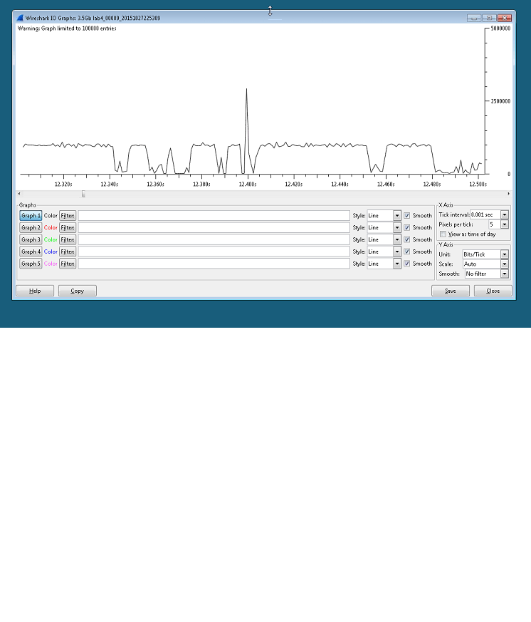
I am trying to understand the IO chart below, sorry I do not have the trace file. I am told this was captured with Wireshark on a laptop connected to a SPAN port. The SPAN port was being sourced from a port channel of 4Gbps.I do not have any specific details on the settings. We can see in the IO Chart sometimes we reach 1Gbps rate but also in the screen shot we can see what I believe is a microburst up to around 3.0Gbps. How can I understand seeing a 3.0Gbps rate while I am connected to a 1Gbps interface? Even as microburst how can IO Chart show above 1Gbps line rate. Thank you in advance for any guidance or suggestions for my research. GP CC
asked 09 Nov '15, 04:34 GP CC |
One Answer:
Think about how the rate is calculated. In pcap, there is no information about capture interface raw speed; in pcapng, there may be, but I assume Wireshark doesn't take it into account (yet?). So you have only the timestamps of the packets, and these are assigned at the moment when libpcap reads the packet from the driver, not at the moment when the packet physically arrives. So while other processes are given the CPU, several packets may arrive under hardware (DMA) control, and then libpcap reads all of them almost at the same time when it gets its time slice. This idea is supported by the short "silence" right before the 3 Gbps peak on the graph. answered 09 Nov '15, 05:01 sindy edited 09 Nov '15, 05:05 |


This would be my best guess, too. If you need more precision, then you should try specialized capture hardware.
I.e., the average rate won't be above the interface raw speed - there might be an apparent-but-not-real surge where packets are arriving faster than possible, because multiple packets are processed in a group by the networking stack and time stamped based on when they're processed, but that will be balanced by an apparent-but-not-real slowdown, while the packets are being put into system memory but the host hasn't been notified of their arrival yet.