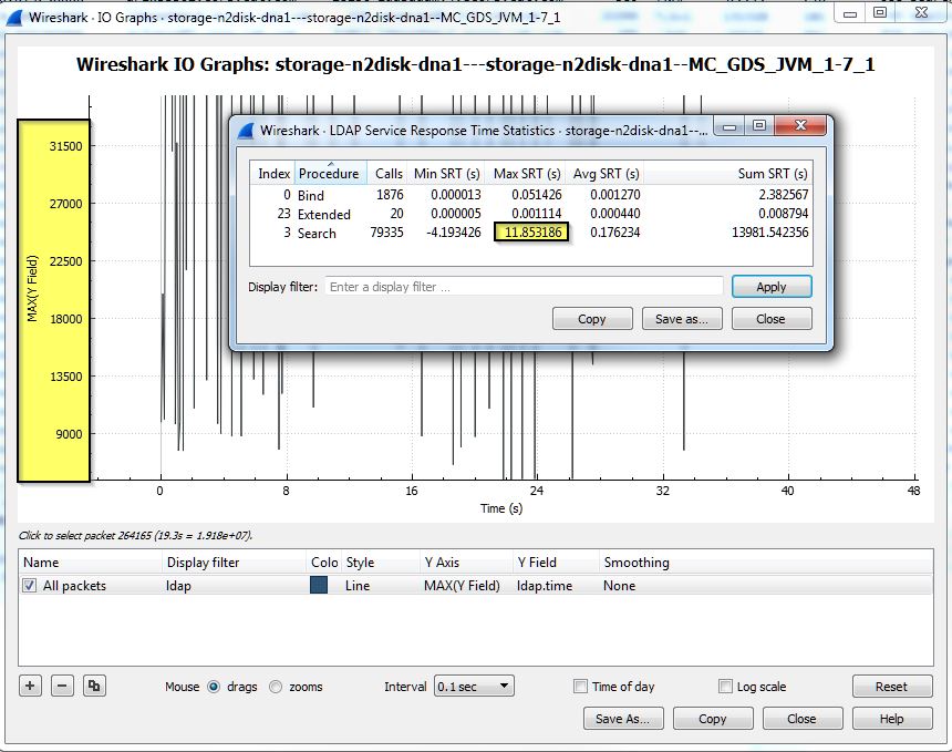
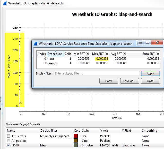
I am having problems graphing LDAP Service Response Time in Wireshark 2.0.1. The Y-axis especially does not seem to be accurate. Has anyone been able to accurately graph LDAP response time? I'd like to see the spikes, etc in graph format. The field occurrence does not matter to me at the moment. Here is a screen shot of the graph. I've tried several options and attempts at graphing it correctly. Essentially, I'm seeing a Max SRT of 11.85 seconds from Wireshark's LDAP SRT statistics window (forefront). However, when attempting to graph those values, I can't seem to get the Y-axis to reflect the correct scale/numbers. Unfortunately, due to the capture containing LDAP/account information I can't upload the actual capture file itself.
asked 07 Jan '16, 11:38 csereno edited 11 Jan '16, 08:33 |
One Answer:
I stumbled back across my question, and it seems the later versions of Wireshark have improved the graphing. It seems to line up a little more. I still have a little learning to do around the graphing (particularly with LDAP and timing), but it seems Wireshark is graphing more appropriately now.
answered 14 Feb '17, 10:22 csereno |


can you please provide a screenshot and (if possible) the pcap file?